
Methodology
Sketching
Prototyping
Moderated Usability Testing
Tools/Software
Figma
Lookback (for usability testing)
Why is this project important?
Customer health scoring is a measure for Customer Success (CS) teams to predict a customer’s risk of churning. The lower a customer’s health score, the higher the risk of churn, and vice versa. The utilization of customer health scores give Customer Success Managers (CSMs) direction on where they should be focusing their efforts. Customers with lower health scores may need rehabilitative attention to improve their interactions with the platform. However, customers with higher health scores may be good candidates for expansion efforts by a CSM.
Because customer health scoring is such an impactful tool for CSMs managing their customers, the workflow for configuring the components that factor into a health score needs to be seamless and easy-to-understand.
The Design Process
This project began with a handoff of previously conducted and synthesized research comprised of competitive analyses and interviews with both internal CSMs and existing customers. After the research handoff, it was important for me to explore our platform to assess the existing method of configuring health score in order to better empathize with our current customers and future users.
My design process for this project resided mostly in the second half of the double diamond model.

Insights
The main insights from the research handoff were centered around users need for clarity in the process of setting up health scoring.
Users need to be able to understand the ways that health scores are calculated
Users need the ability to customize health scoring for their accounts
Users need easy-to-understand visualizations of health scores, including the components that factor in, and the weighing of those components
Research participants also shared that their health scores were mainly based on the CSM’s interpretation of the customer’s health and not backed by actual data.

How might we….
Redesign the health score configuration process to improve clarity and customization for customers?

As we brainstormed ideas and sketched, we kept in mind our goals of more customization and clearer visualization.
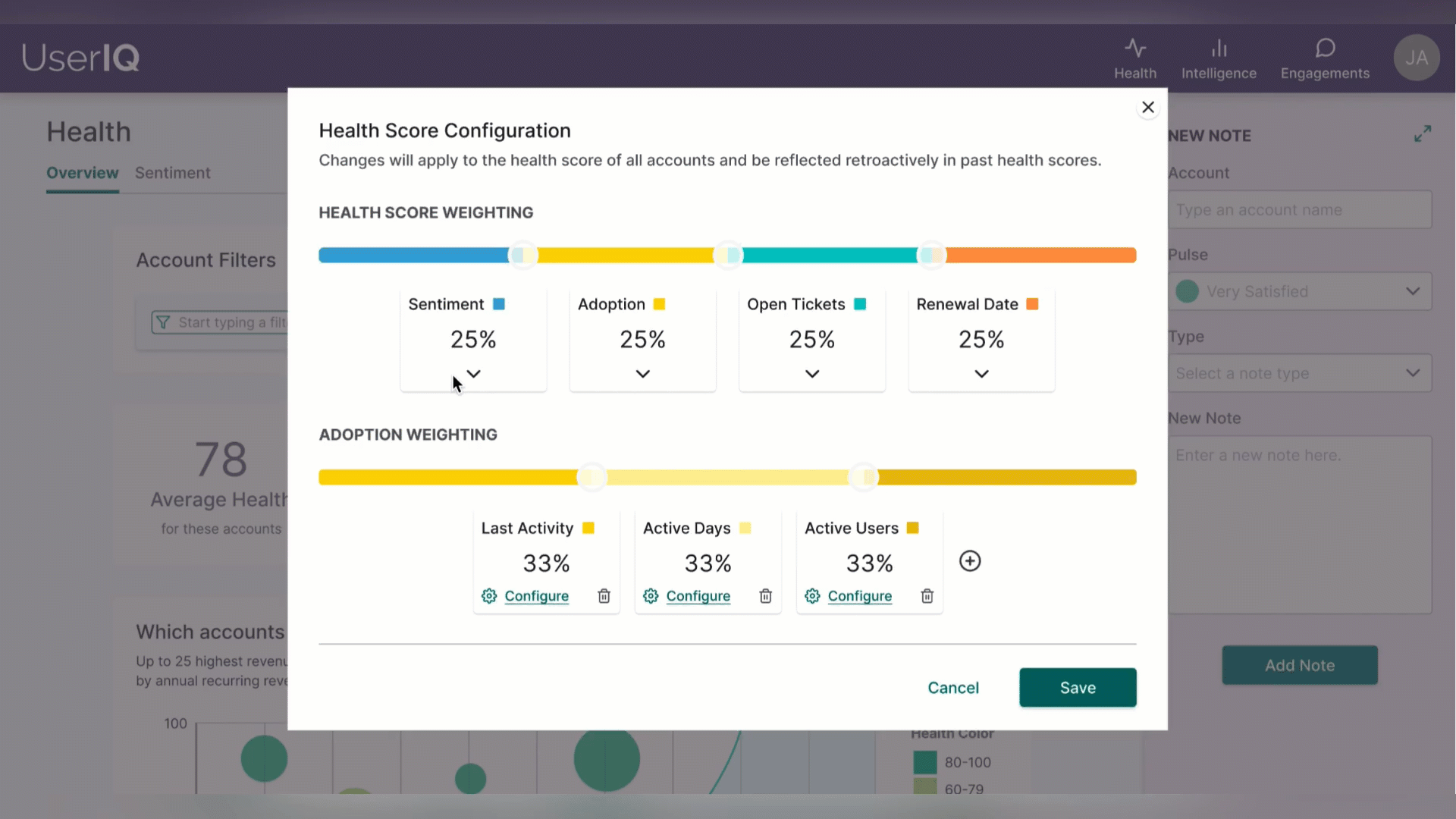
Our redesigned framework of health score customization:
There are main components that factor into the health score and can be weighed differently (for example, factor A can weight 25% more into the health score than factor B).
The main components are comprised of multiple subcomponents whose individual weights can also be adjusted.
Each subcomponent would need to be configured, meaning the user would need to define what’s “optimal” (a score of 100) and what's “critical” (a score of 0). The system would then apply the appropriate scoring for everything in between.
A more interactive solution
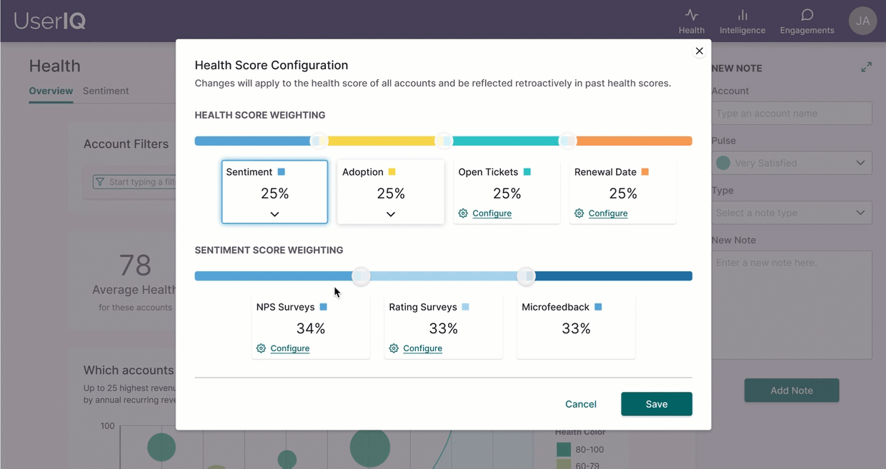
The main components nest the subcomponents, and users can see those nested subcomponents by clicking on the main component.
The usage of coordinated hues of a single color visually link the appropriate components and subcomponents.

Sliders provide users a more interactive way to set weighing for their components and subcomponents.
As a user interact with the slider, they visually see the result of their interaction as the weight of the corresponding component or subcomponent changes in response.
Configuring Confusion
Moderated usability testing with 5 recruited participants revealed that users intuitively understood the functionality and purpose behind the weighing sliders. However, when users continued the flow by clicking into configuring the subcomponents they were confused about how those sliders in the designs would be used in relation to the optimal range and critical range fields.
My proposed solution was to simplify the designs by getting rid of the sliders in this area and keeping only the labeled input fields that used color to help communicate what’s good (optimal) and what’s bad (critical). Iterating on the designs and re-testing with 3 recruited participants showed that 100% of users understood the concept of optimal and critical as defining what is ideal behavior (optimal) and what behavior needs attention immediately (critical).

Next Steps
This project launched in fall of 2021. Customers that have used the new implementation have given feedback that they’d like more visualization for what lies between the “optimal” and “critical” endpoints. To continue iterations on this design, I would conduct research to specify pain points within the new workflow, ideate on how to solve the problem, and carry out unmoderated usability tests with existing customers.
Reflection
Starting from the middle of the double diamond model for this project was different from other end-to-end projects I’ve been involved in. While I enjoy synthesizing data to look for existing patterns and themes, it was still a learning experience to ideate off of handed off research instead.
This project also taught me that there’s often not a straight path to a solution. At times simplification is the answer, but then you might find that you’ve pared back too much and that users need more context within the UI. The important thing is to continue to be open to feedback and exploration of the problem until you land on a solution that maximizes the experience for the user.