
The Homer Fund Project
The Homer Fund is a non-profit charity associated with The Home Depot. It was created in 1999 with the primary focus of providing financial help to the brand’s associates that are in need.
Our task was to increase associate engagement and donations to the fund year-round through a website re-design.
Project Details
Collaborative effort with 3 team members
Constraints: 2.5 week deadline
Deliverable: high fidelity prototype
Tools: Adobe XD
UX Methods used: Interviews, Surveys, Affinity Mapping, Data Visualization, Jobs-to-be-done, Heuristic Analysis, Site Mapping, Card Sorting, Sketching, Wireframing, Usability Testing
My core responsibilities
Leading data synthesizing
Documentation of research
Creating high-fidelity mockups
The Process + The Pivot
Research
Through our use of Interviews and surveys with The Home Depot employees, we discovered that associate engagement is already high.
Since this info conflicted with our initial objective, we had to consider how to move forward.
Refocusing
Most associates were visiting the site either seeking assistance or to find out more information on giving to the fund.
Our research highlighted a completely different issue: associates visiting the site found it difficult to navigate.
Redesign
We decided it would be most impactful for us to focus our energies on redesigning the website to give employees easier access to:
(a) receive help
(b) give help to those in need

Our main priority: prioritize access to employees’ main goals for visiting site
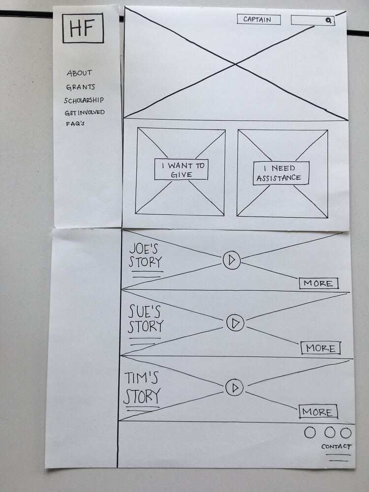
With visitors coming to the site with one of two intentions in mind, we knew we needed to simplify the home page and increase discoverability to help them achieve their purpose.
Our designs did this by highlighting two main landing points on the home page. The goal for these landing points was for users to easily locate how to receive assistance and how to offer assistance to their colleagues.
Usability brings clarity, literally.
Through conducting 4 usability tests with The Home Depot associates, we found that users were able to accomplish the tasks provided them without any significant roadblocks.
The tests did reveal small but impactful changes that could improve the user experience overall and increase task completion efficiency.
Confusing wording
“I want to give “ and “I need assistance” became clearer calls to action for users to follow.
Misleading fold
Users weren’t aware they could find videos of past recipients to see who past donations benefited below the fold. Scooting the videos up to peek above the fold provided users incentive to scroll down.
Invisible tools
A gray Search icon blended into the background. Giving it a pop of color made the helpful tool stand out to users.

What else do associates need?
More discoveries from our research that we incorporated into our designs
More Insight

Associates wanted more insight and transparency on who their donations are helping.
We designed a page centered on past recipient’s stories while also providing a space for more recipients to share their experience if they’d like.
A Clearer Path
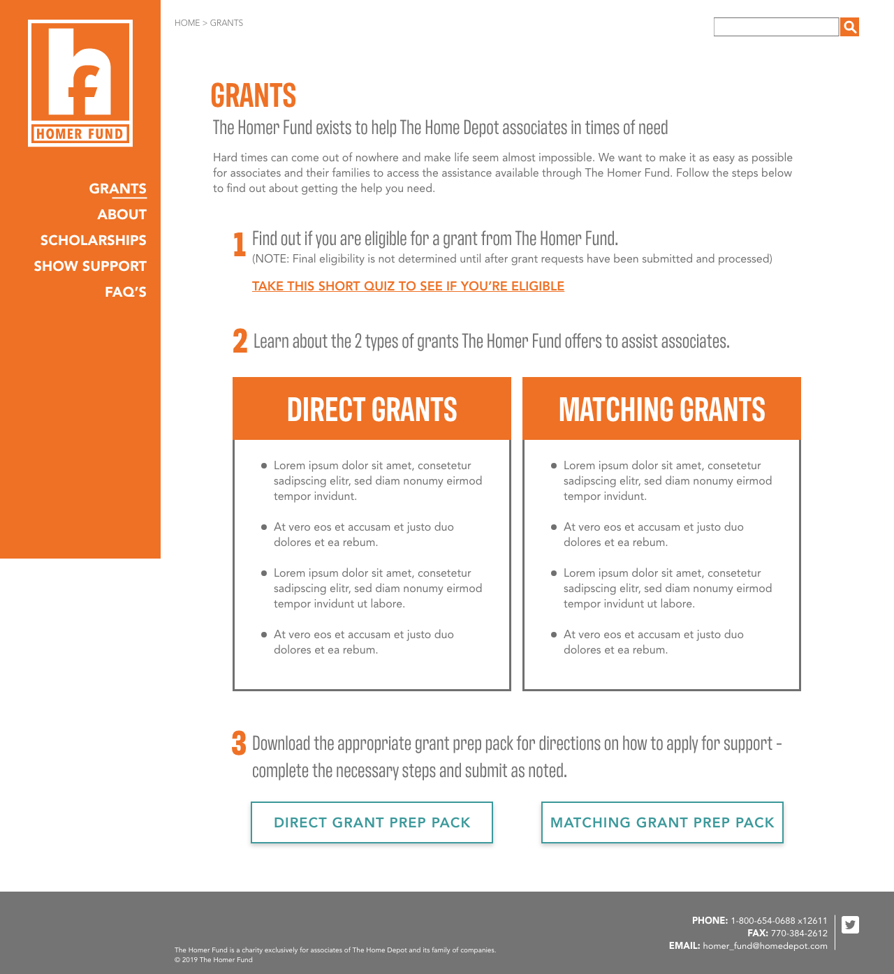
Associates needed a better flow to access the information they needed.
We redesigned the IA of this page, providing associates in need of financial help with a clear path to follow from start to finish.
More Ideas
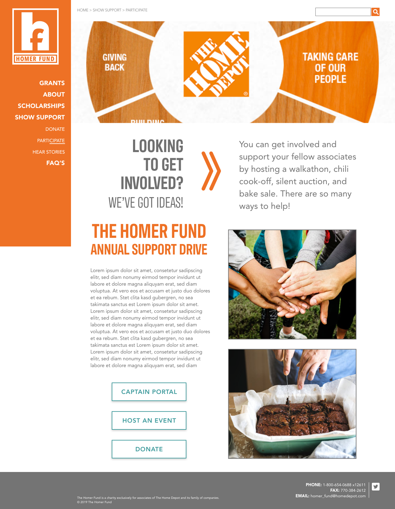
Associates needed a resource for fundraising ideas for The Homer Fund.
We designed a page to not only house suggestions for fundraising events but also kickstart a new event.
Lessons Learned
This project was an awesome learning opportunity, especially as a new designer. The most important lesson I learned was that research never ends. New insights continued to come in throughout the duration of our project that had major impacts on the outcome of our designs.
With new insights repeatedly being revealed, I also learned the importance of being adaptable and ready to pivot. Our research completely negated our initial objective, which admittedly threw us for a loop. However, we cleared the fog and confusion to build a new path to navigate this project successfully.